
The Story Behind Stardex's New Logo and Brand

When we started the company two years ago, it was called Wharf. We designed a quick logo, moved on, and when we renamed to Stardex, we just never got around to updating it. Classic founder priorities.
Over time, one question kept coming up: What does “Stardex” actually mean?
It’s simple: Star + Rolodex.
The Rolodex was invented in Brooklyn in the 1950s by Arnold Neustadter. When it first hit the market, stationery shops were skeptical that anyone would want one on their desk. By the 1980s, it had become so iconic that companies filed lawsuits against former employees who took their Rolodex with them when they left. Having one filled with the right names meant everything.
That’s basically how recruiting still works. Search firms sit on some of the most valuable networks in the world: relationships, past searches, notes, assessments, and compensation data. The Rolodex was how recruiters used to operate, and while the world has shifted, the core idea hasn’t.
One of the key areas we focused on early was helping firms find the best fits within their own database. The name felt right. And the fact that it was invented in Brooklyn felt personal too, since both Pranav and I have lived there.
The Logo
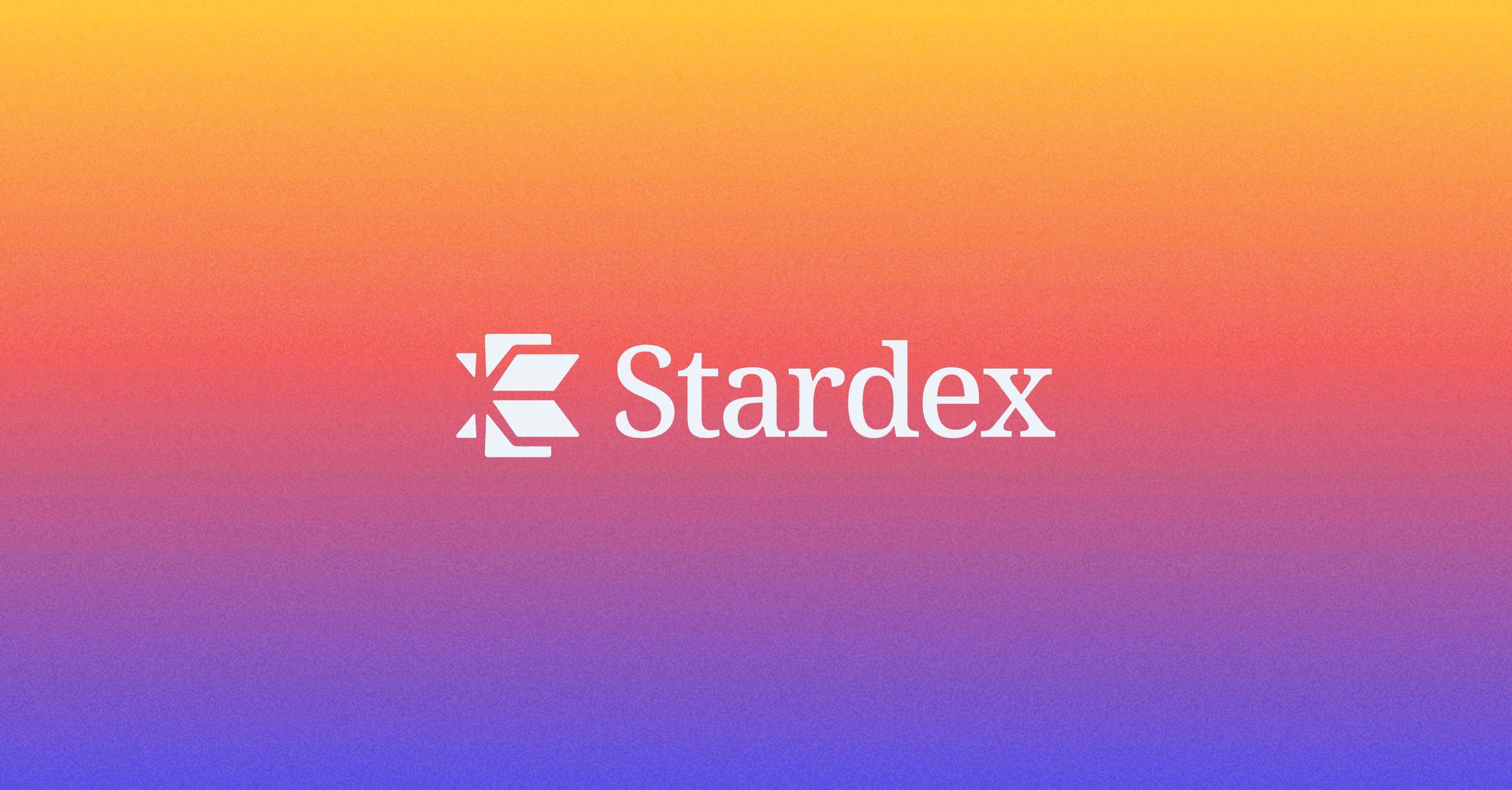
We worked with our brand designer to bring this to life. The logo had to reflect that idea. The new mark is a Rolodex, but if you look closely, there’s a subtle star hidden in it.
The Font
Most ATS and recruiting tech products default to clean sans-serif fonts. We went with Noto Serif. It feels more established and distinctive, and creates an interesting contrast with the modern logo mark. The body typeface is Plus Jakarta Sans, which keeps things clean and readable across the product.
The Color Palette
We built the palette around Midnight Indigo (#4F46E5) as our primary color. It feels professional without being boring.
From there:
Vibrant Mango (#FFC32C) as our accent — adds energy without being loud
Crimson Coral (#F05555) as a tertiary color for alerts and emphasis
Midnight Ink (#0B0F19) for dark backgrounds
Lavender Frost (#DCDAFA) for lighter UI surfaces
Glacier Blue (#EDF3F9) for secondary highlights
Steel Gray (#9D9FA3) for supporting text and borders
The goal was a palette that feels modern but not trendy, something that holds up over time.
What’s Next for Stardex
We’re refreshing the website to align with the new brand and adding more case studies from the search firms we work with to show how they’re using Stardex to surface the right candidates from within their own databases instantly.
Stay tuned.


